Loud Packs

BRAND IDENTITY DESIGN
Kristen Best
GRAPHIC DESIGN
Kristen Best
CREATIVE DIRECTION
Purple Line Media
PACKAGE DESIGN
Kristen Best
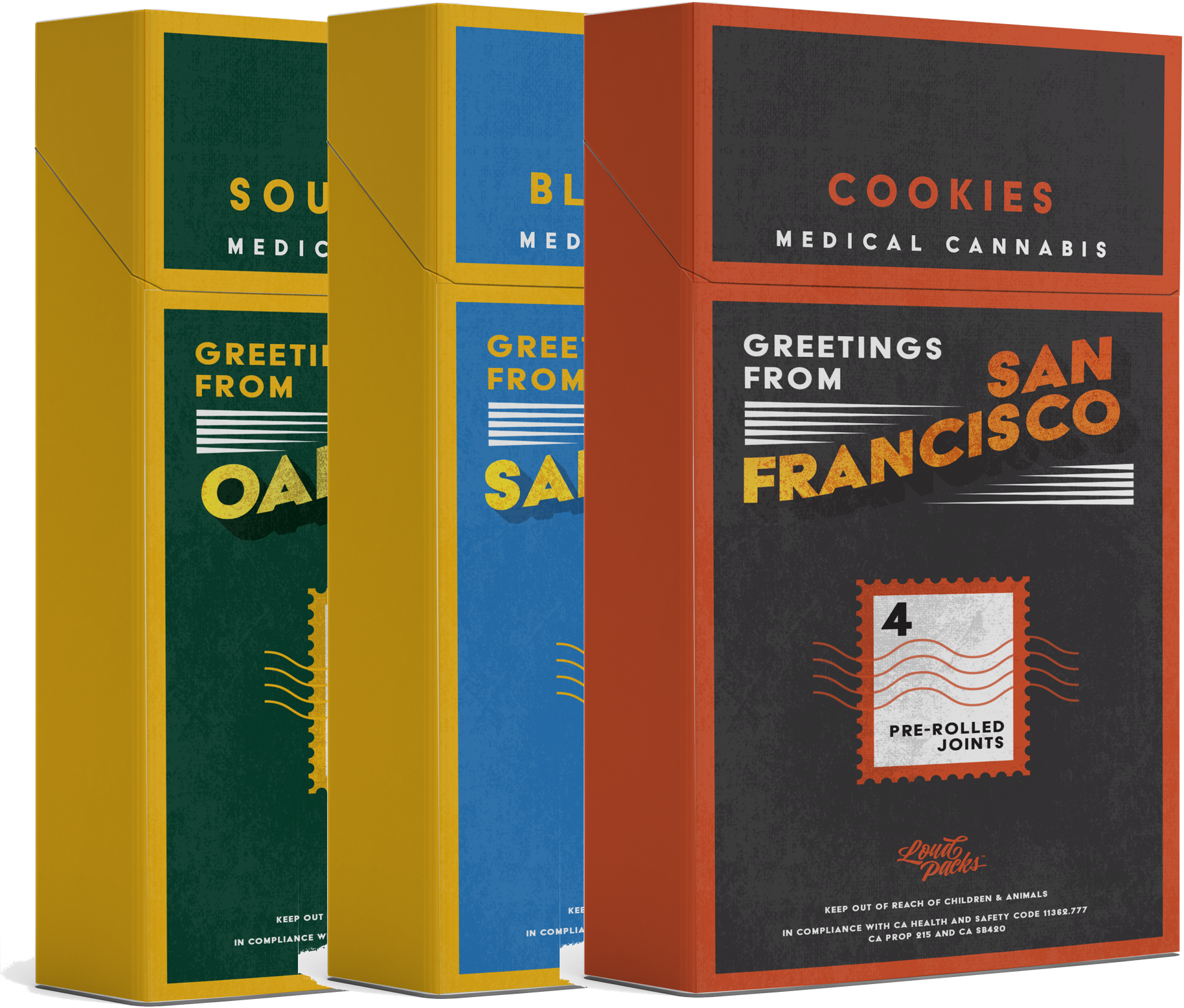
Loud Packs is a cannabis company based in California. They had a specific vision that they wanted to implement – to showcase some of the most popular spots in California via one thing that so many people love…sports! We designed their logo + brand identity as well as the package design for their pre-roll packs.
THE LOGO
The Loud Packs logo was inspired by urban streetwear brands. Our goal with the mark was to exemplify youth & street smarts, and to have something that would work well in one color.


PACKAGE DESIGN
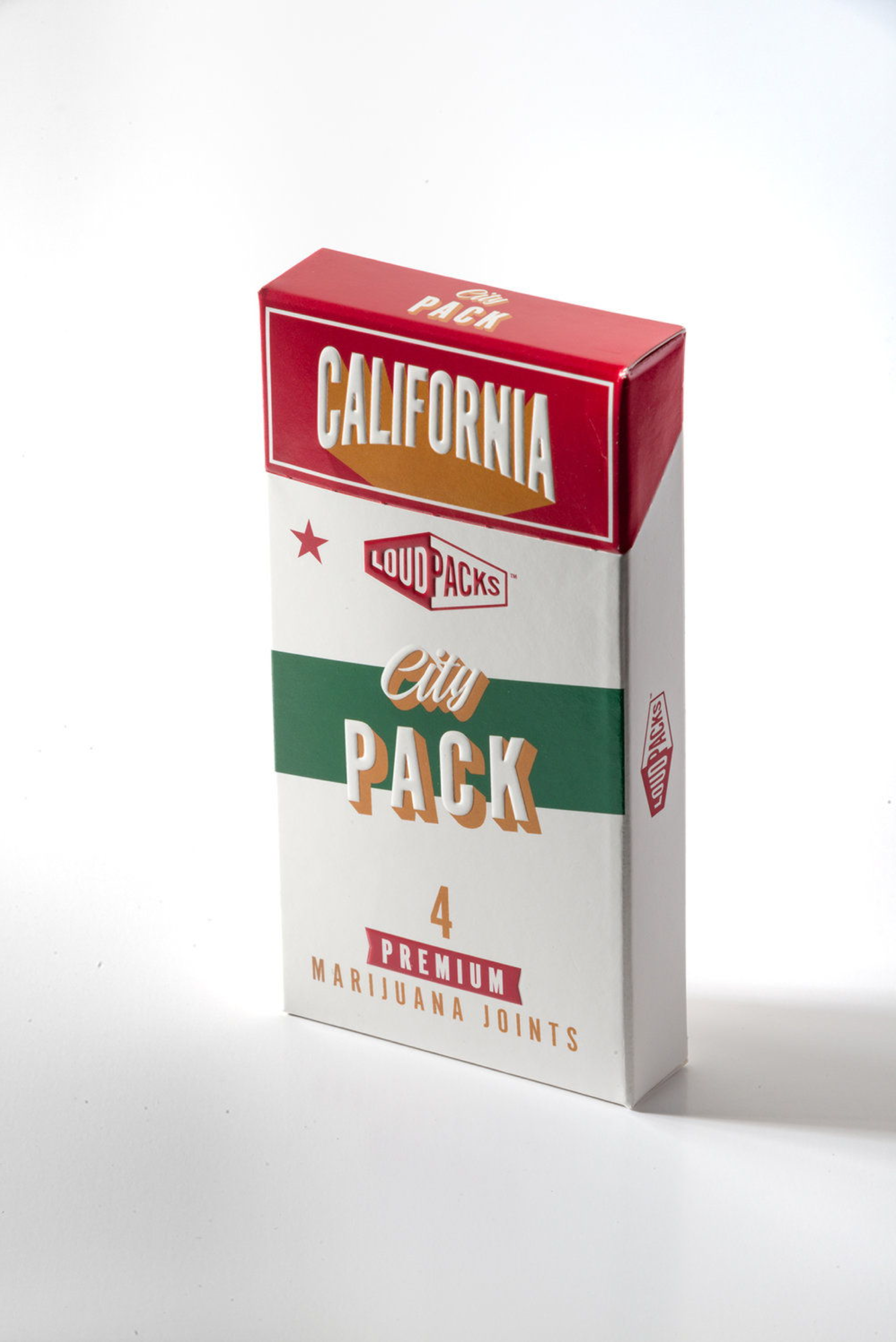
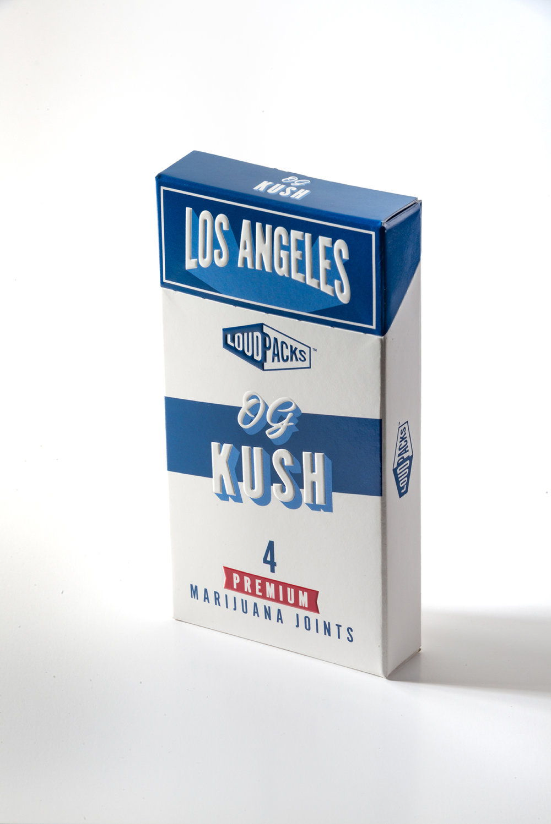
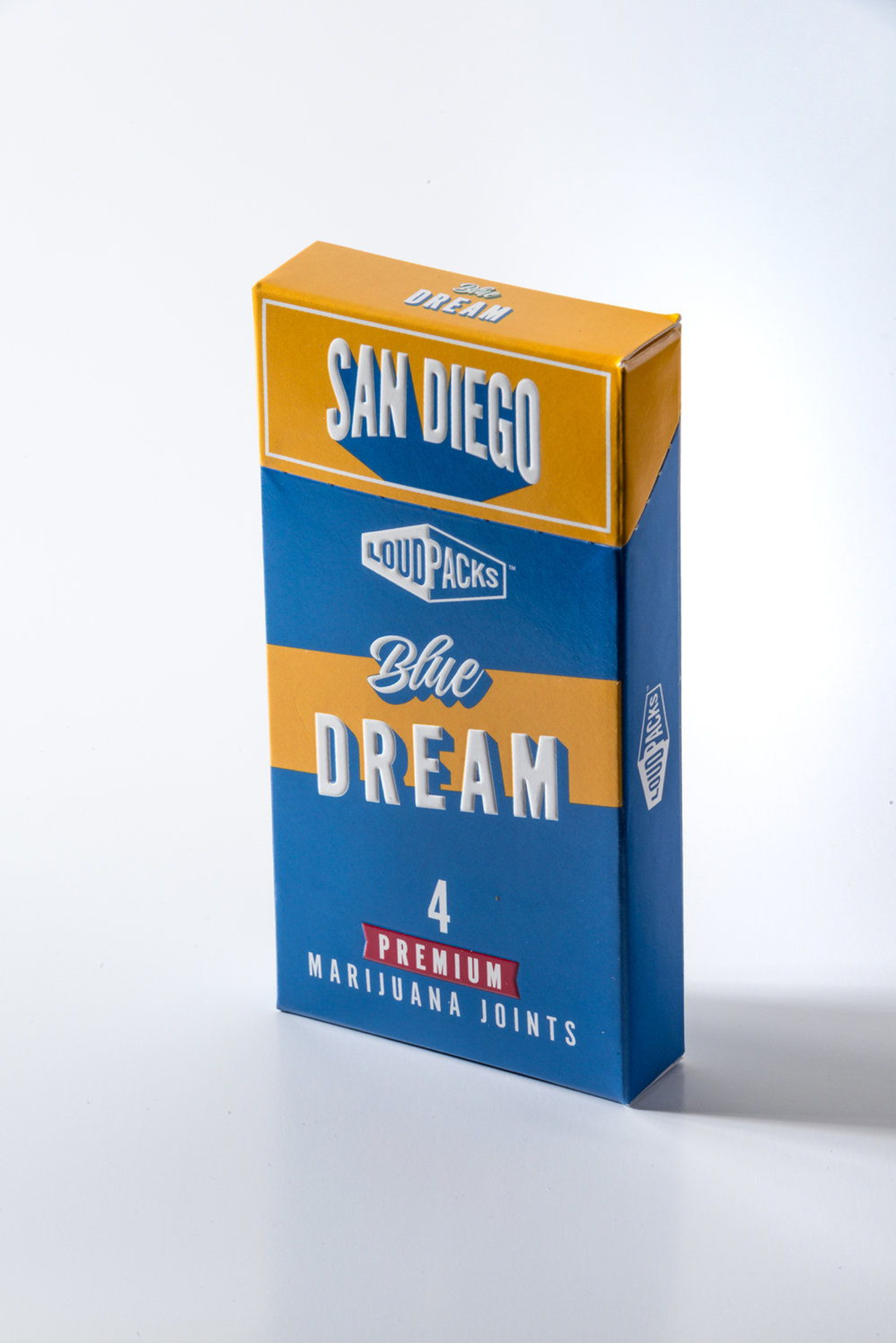
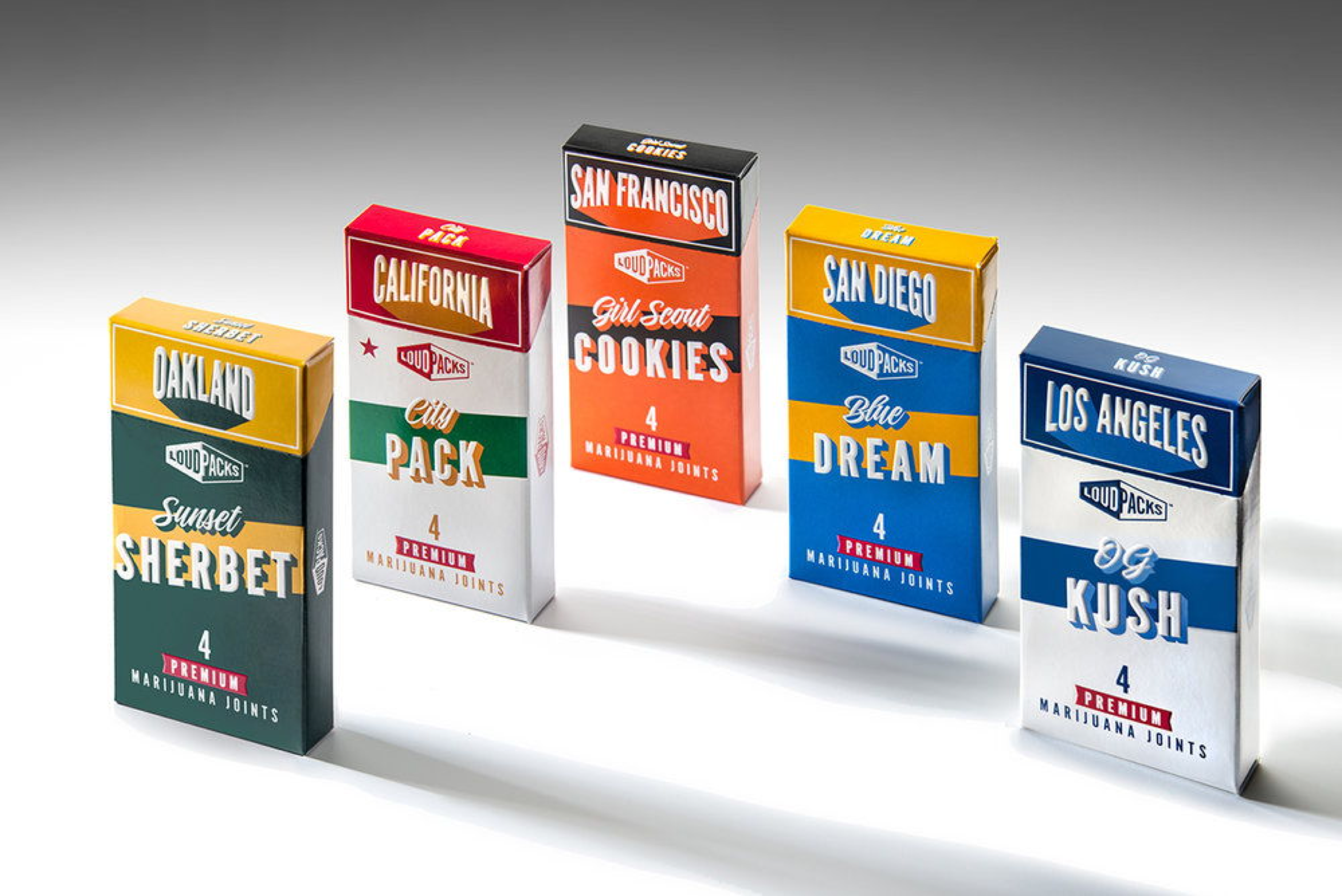
The final design for the pre-rolls made use of city-specifc nomenclature. We added a spot UV coating to all the text which creates a nice tactile feel. The strain name is included on both the front and the top of the boxes for versatility within the shelf space.
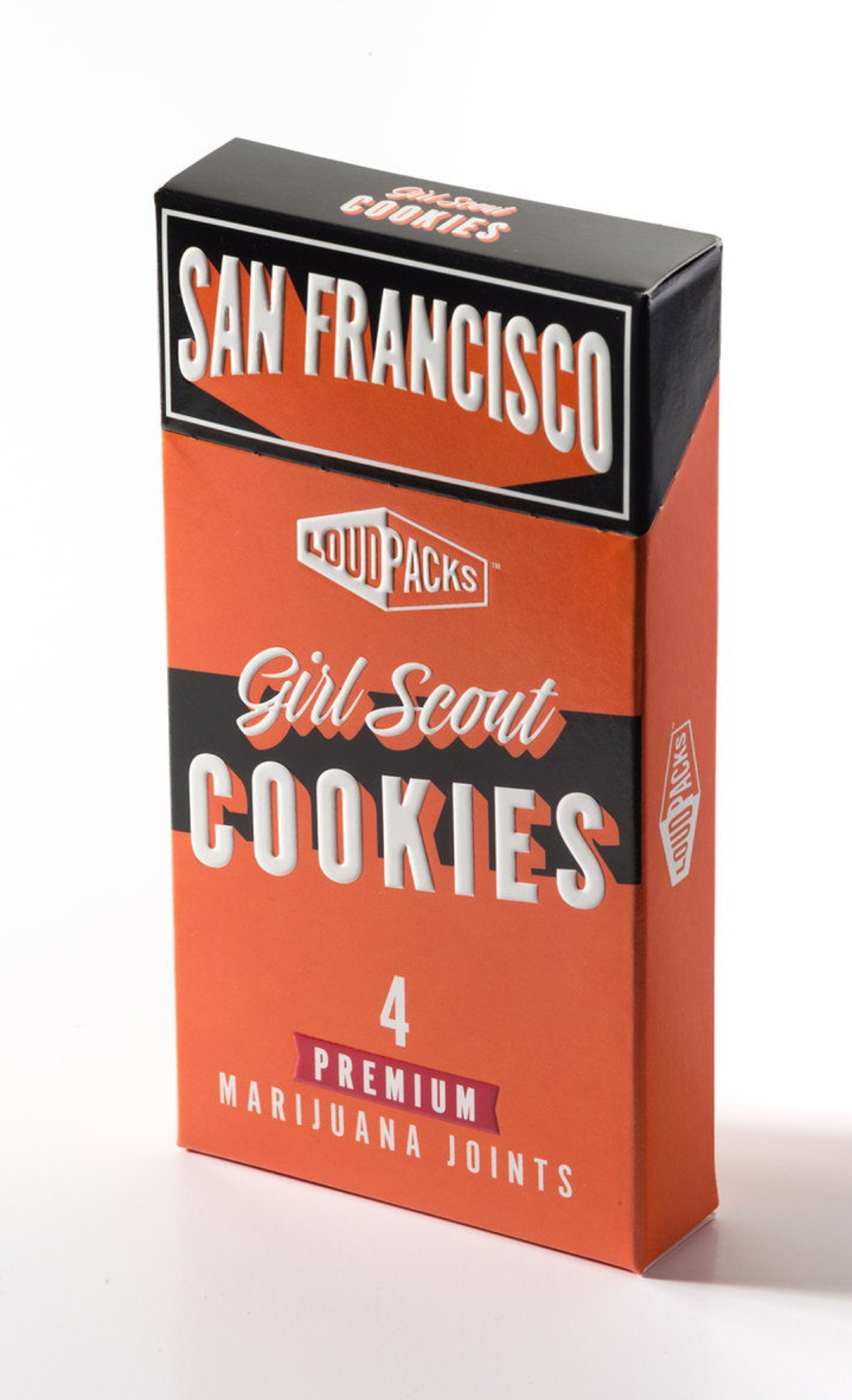
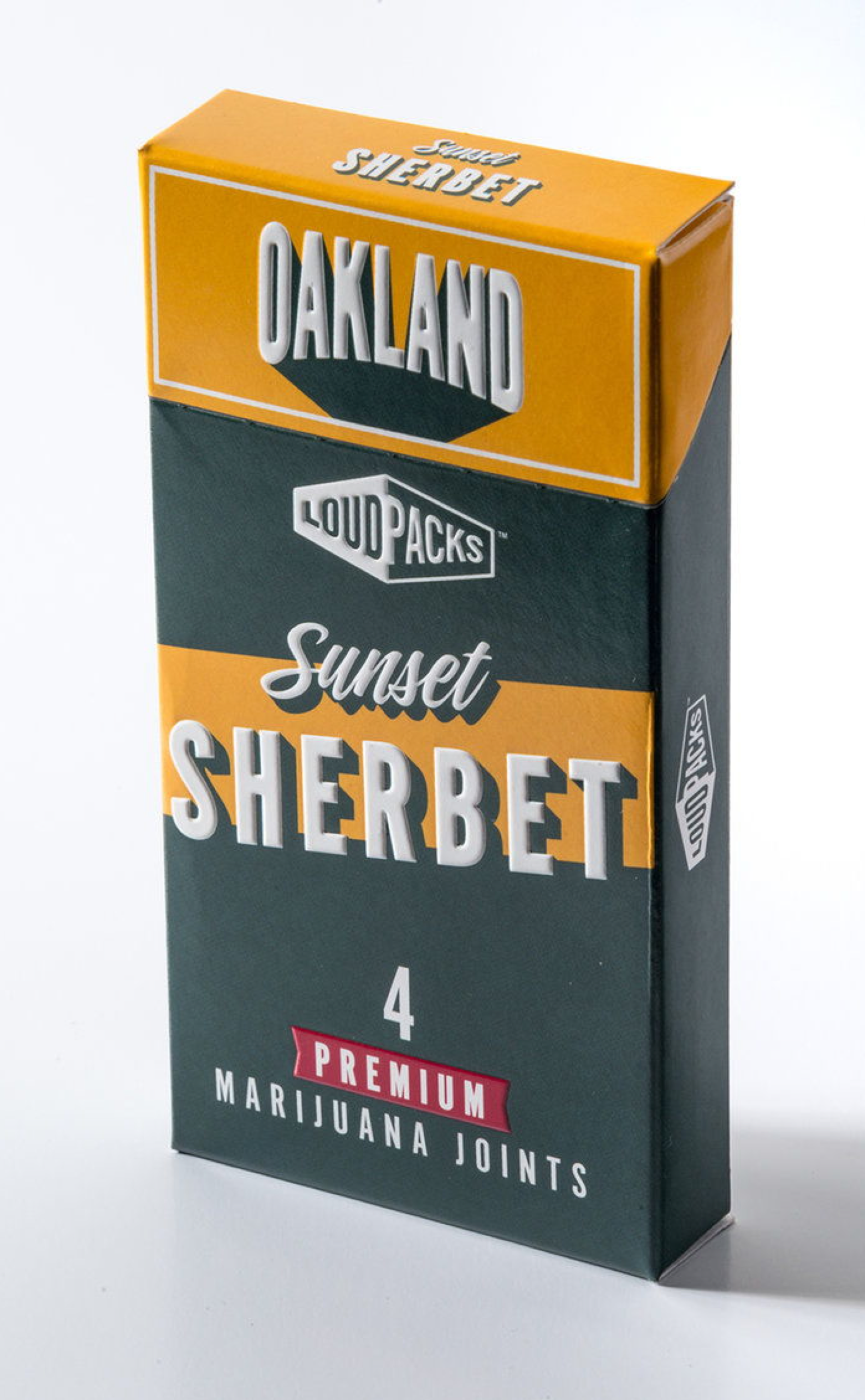
THE COLOR SYSTEM
Each strain uses colors from the iconic sports team of each location. SF Giants, LA Dodgers, etc. The intention was to create an association immediately on the shelves by using color combinations people were already familiar with and already had an emotional connection to. We also designed a California City Pack, which consisted of a joint from each city’s pack, and feature the colors of the state flag on its exterior.


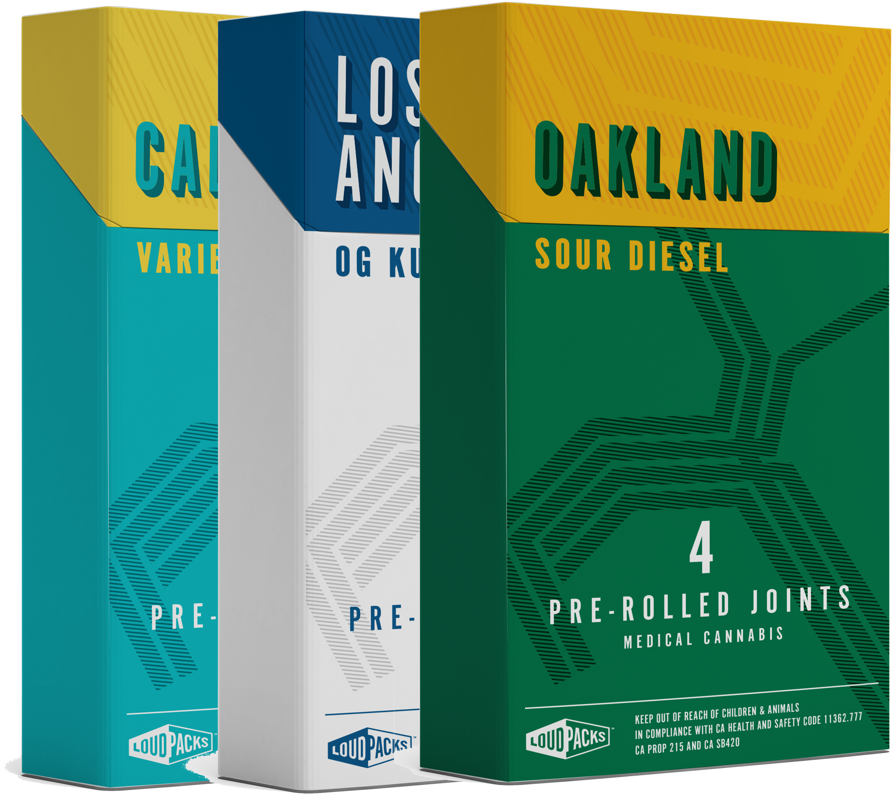
PROCESS
We explored a few different directions for these packs. Below, on the left, is a direction that we came up with that would eventually feature the public transportation lines of each city on the front of the packaging. On the right we went with a version inspired by vintage postcards. The idea with these was that they could also be souvenirs for family and friends.
Check out Loud Packs here, and if you want, read the article about the packaging on The Die Line!